Fashion spring-summer 2024
Trendy colors spring-summer 2024
Usually, in the analysis of the main trends, we first of all consider what the silhouettes, shapes, proportions are. But now let's pay attention to the color scheme of the new spring-summer 2024 season.
What color palette do designers offer us in a warm season spring-summer 2024?
The spring-summer season tends towards optimism. Therefore, several directions can be distinguished in the color palette: a light palette, where the main color is white, red tones, green, red, blue.
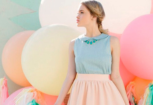
In the light palette, as already mentioned, white is used - from snow-white to dark baked milk and smoky shades that resemble fog that rises in the early morning. In the pastel palette, one cannot fail to notice shades from light beige to pink blush.
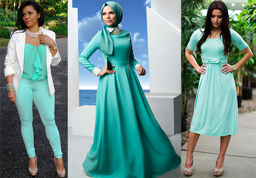
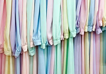
The flesh tones blend in with the models' skin. Heavenly colors, sandy, menthol - the whole range of light tones is permeated with light and harmony with nature. There are pastel shades in which the color is barely indicated, and such shades seem ghostly, light and fabulously airy.
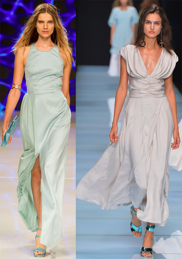
Aigner, Anteprima
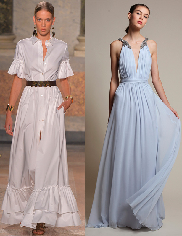
Blugirl, Marchesa Notte
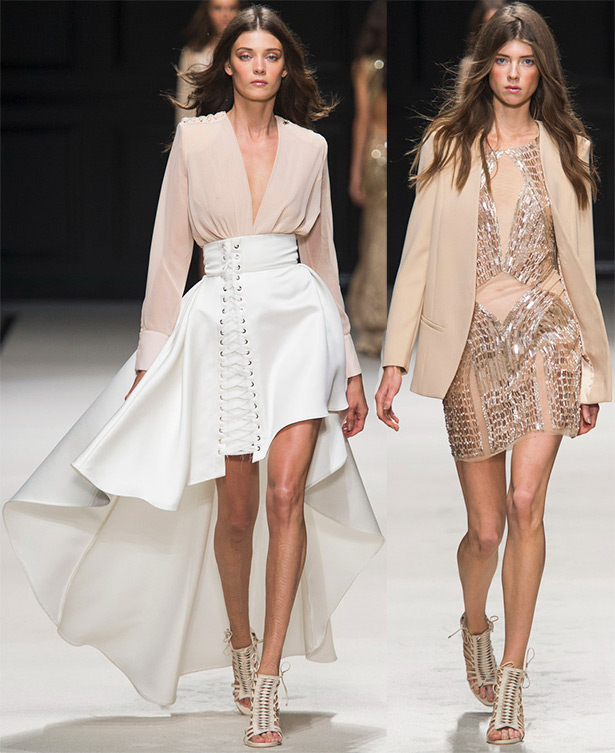
Elisabetta Franchi
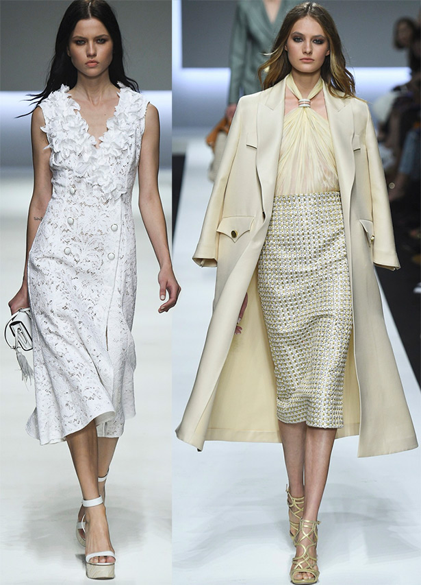
Ermanno Scervino
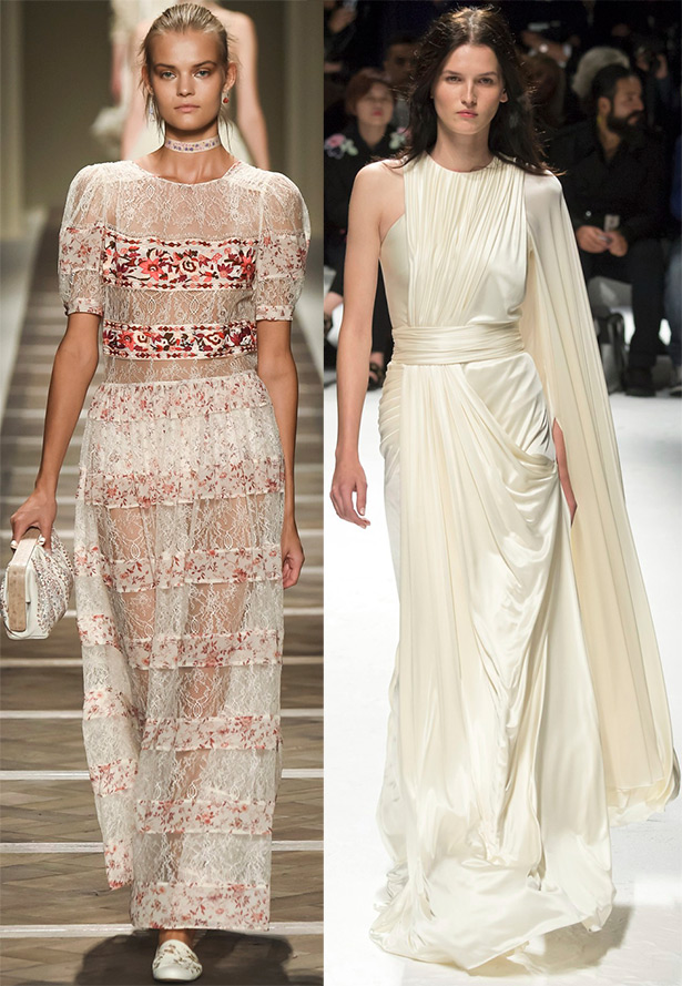
Photo above - Etro, Fausto Puglisi
Photo below - Apu Jan, Balmain
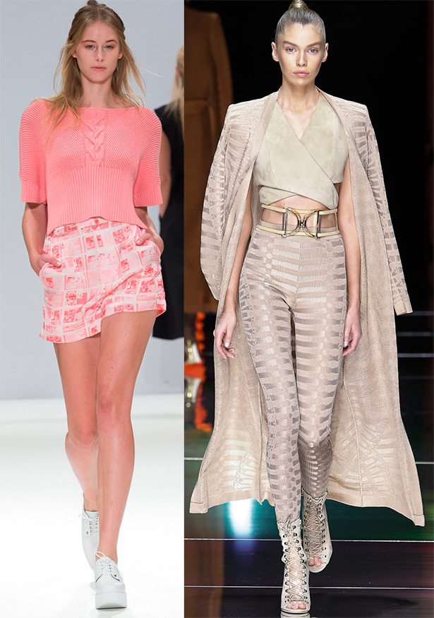
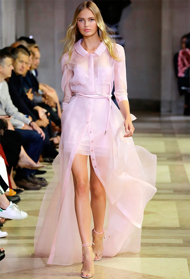
Interesting romantic solutions are offered in the Carolina Herrera collection based on various shades of white. Sheer silk fabrics create a fantastic palette - from dazzling white to pinkish haze reminiscent of morning dawn.
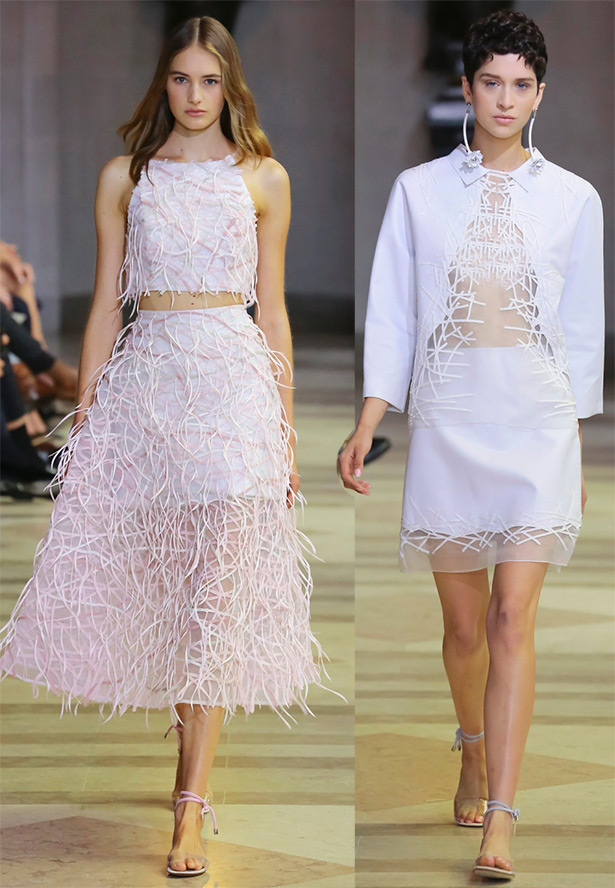
Carolina herrera
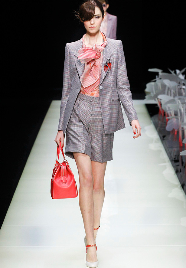
The collections of Emporio Armani and Giorgio Armani have a spring mood with a cheerful and exquisitely elegant palette of pastel shades.
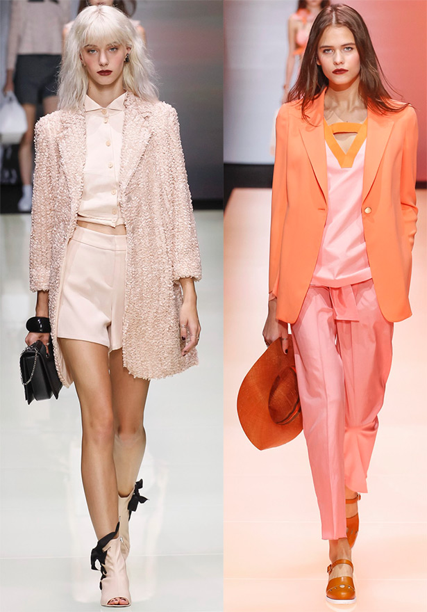
Emporio armani
Giorgio armani
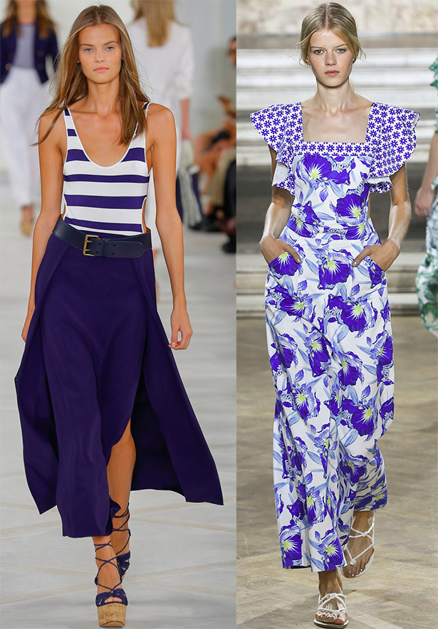
White goes well with contrasting colors - brown, blue, red and many others. These can be individual items or elements of a set, accessories, or just a contrasting print on a light background. These color combinations look bright and elegant.
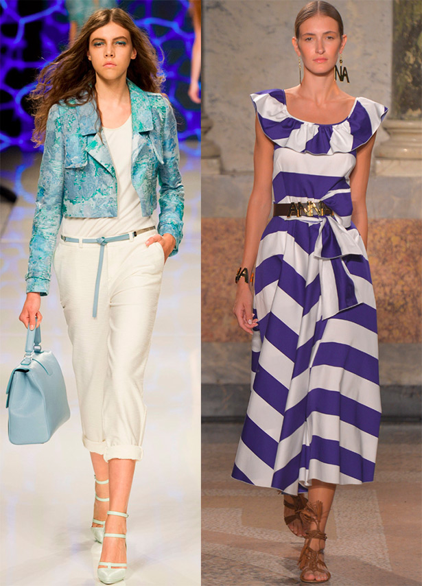
Aigner, Blugirl
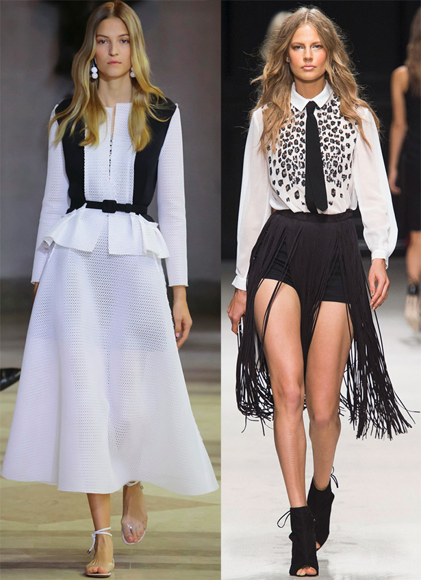
Carolina Herrera, Elisabetta Franchi
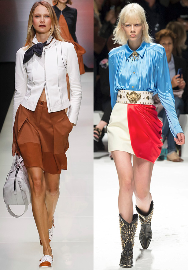
Emporio Armani, Fausto Puglisi
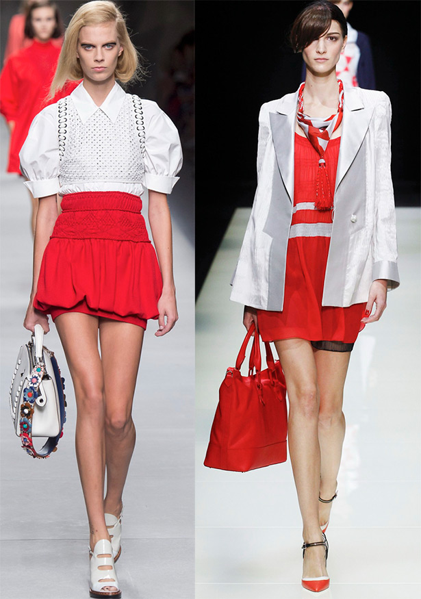
Fendi, Giorgio Armani
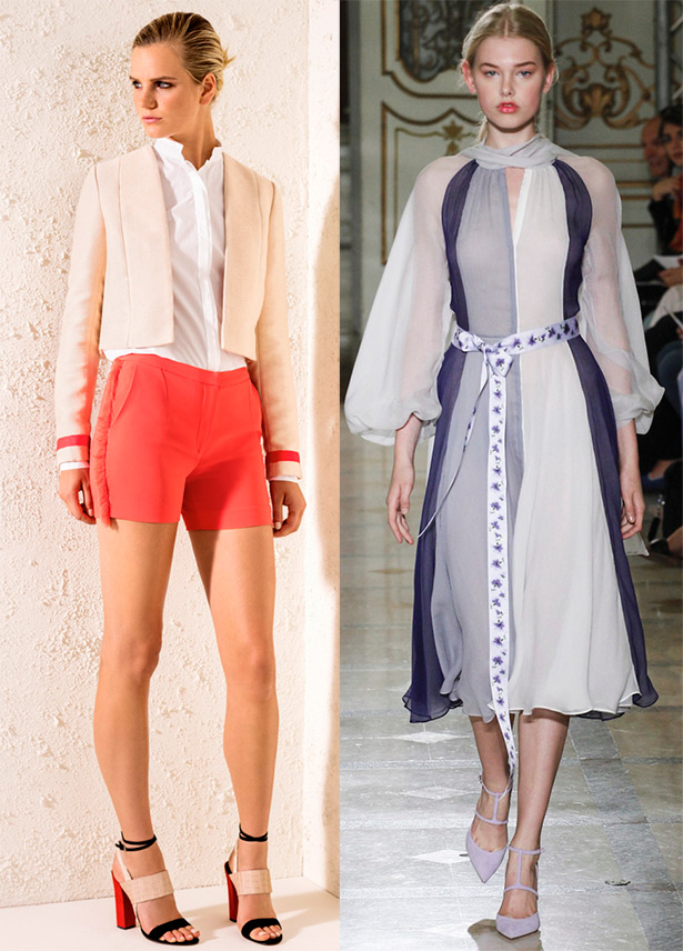
Jeffrey Dodd, Luisa Beccaria
Ralph Lauren, Temperley London
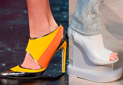
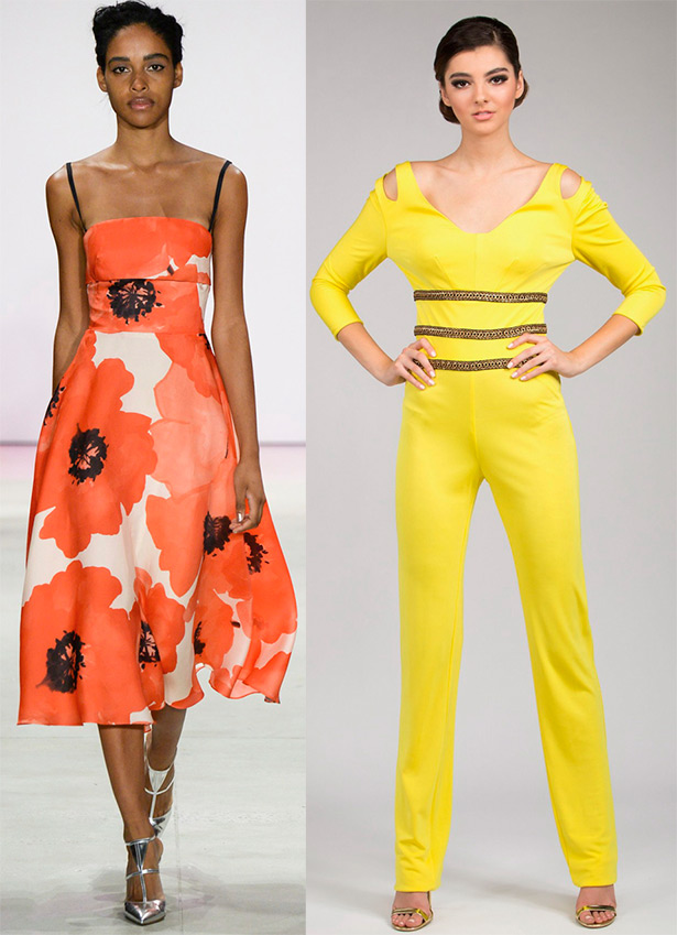
Against the background of a delicate pastel palette, more juicy tangerines, yellows and fuchsias stand out brightly and cheerfully.
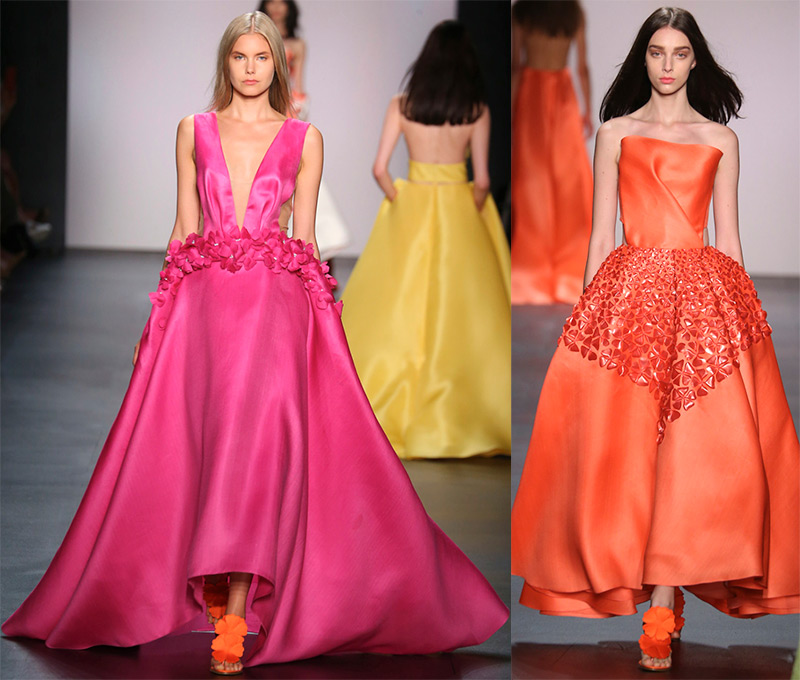
Angel sanchez
Lela Rose, MIMI Tran
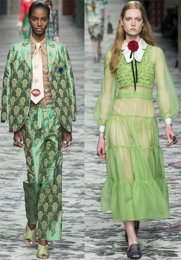
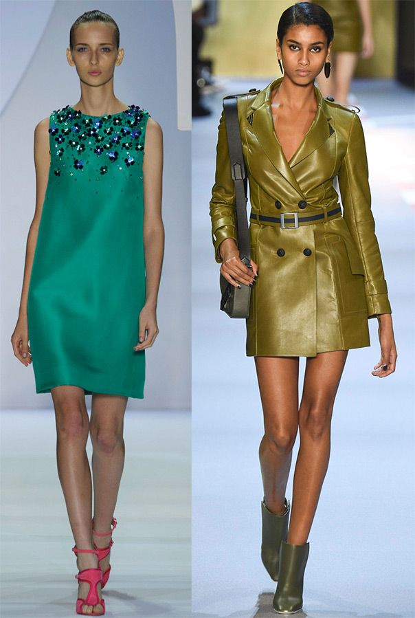
Green color - from dark green to shining green. This color scheme is found in many collections. Versace, Gucci play it especially carefully. The green in these collections breathes the freshness of young foliage and grass.
The green range is extremely rich in its shades - emerald, jade color, eucalyptus, khaki, olive, avocado, blue-green - aquamarine, neon greens and many other colors that connect us with nature, where green is the most common color and carries a balance of warmth and coolness.
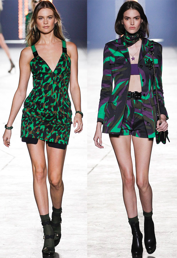
Versace
Gucci
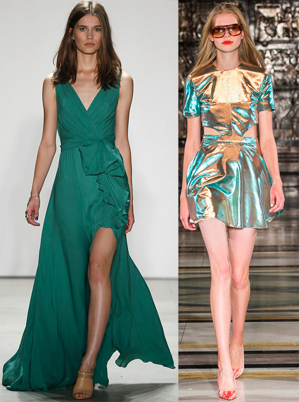
Jenny Packham, Felder Felder
Monique Lhuillier, Mugler
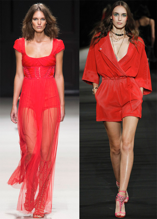
Relevant red tones... But is there really a season in which red remains in the shade and does not manifest itself in any way. Reds are represented by bright berry-fruity tones - from dark burgundy to light red, as well as red with numerous coral shades.
Red is the color of beauty and energy, attraction and passion. From coral to burgundy, this palette is where you'll find your color.
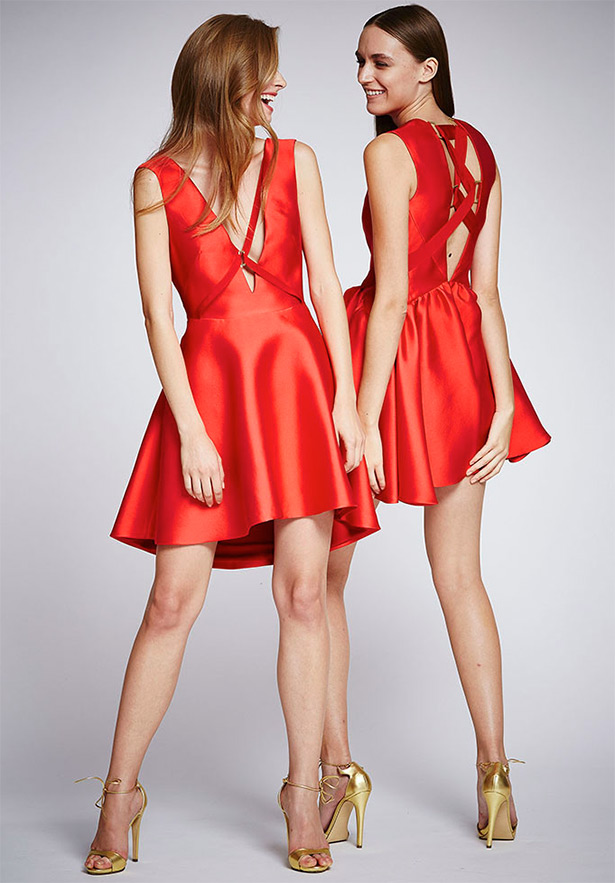
Zuhair murad
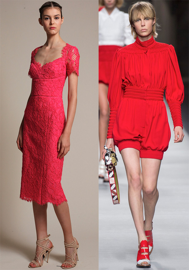
Marchesa Notte, Fendi
Elisabetta Franchi, Alexis Mabille
Blue tones - from a water mirror (gray-blue) to hypnotic ink (dark deep blue). Blue is the color of the sky and sea, sapphires and turquoise, morning fog and blue air. If you strive for harmony and tranquility, then choose blue.
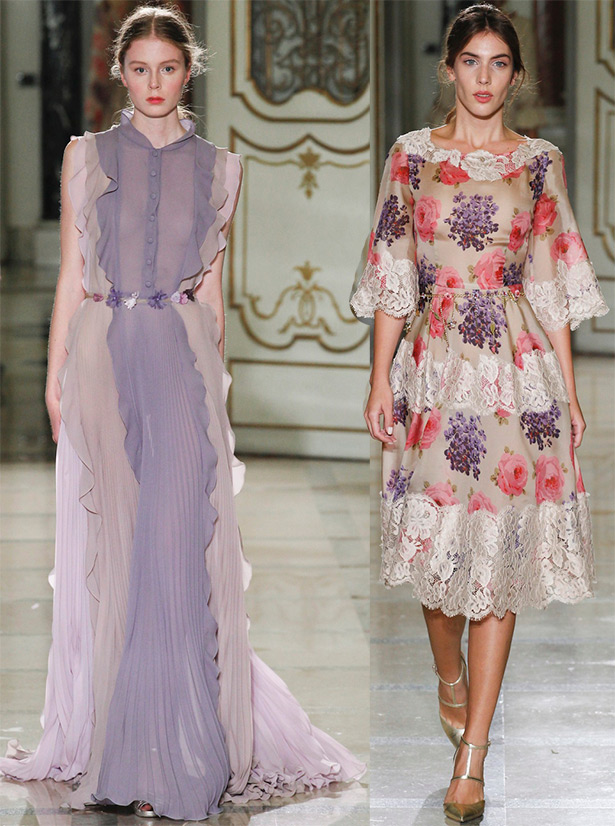
The palette in blue colors looks cheerfully in Chanel tweed fabrics, blue and purple wildflowers are romantically combined with lilacs at Luisa Beccaria.
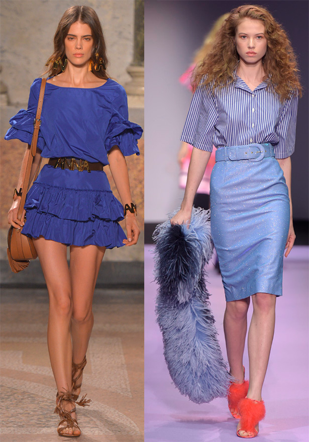
Blugirl, Daizy Shely
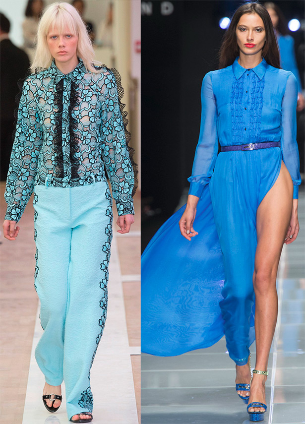
Emanuel Ungaro, John Richmond
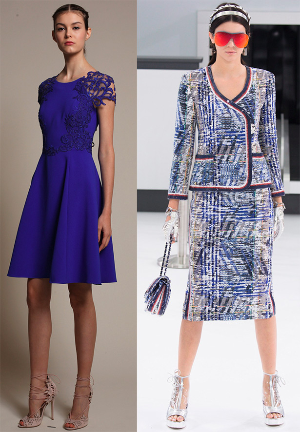
Marchesa Notte, Chanel
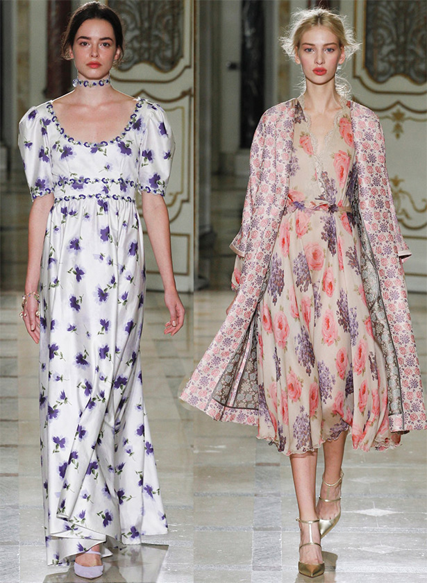
Photo above and below - Luisa Beccaria
Bright red color blends luxuriously with many other tones. It can be performed both solo and in tandem with other bright colors - and in all cases it will look a win-win.
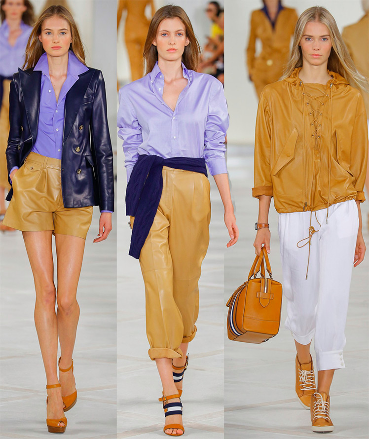
Ralph Lauren
Balmain
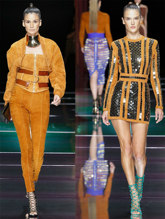
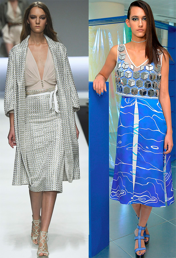
Silver - from dull to melted, found in many collections, and seriously asserts itself. The silver shine is further enhanced in dresses woven from mesh, or with rhinestones and reflective plates.
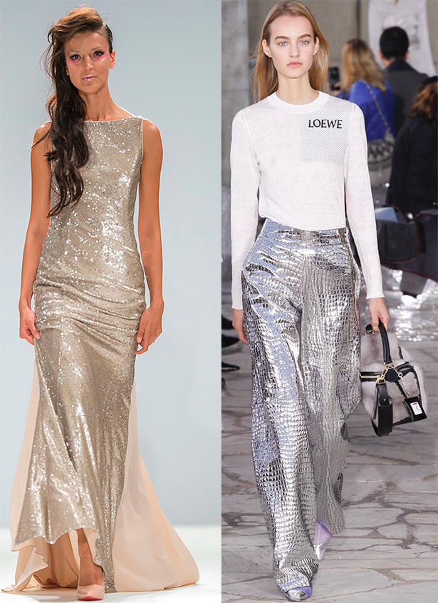
Rohmir, Loewe
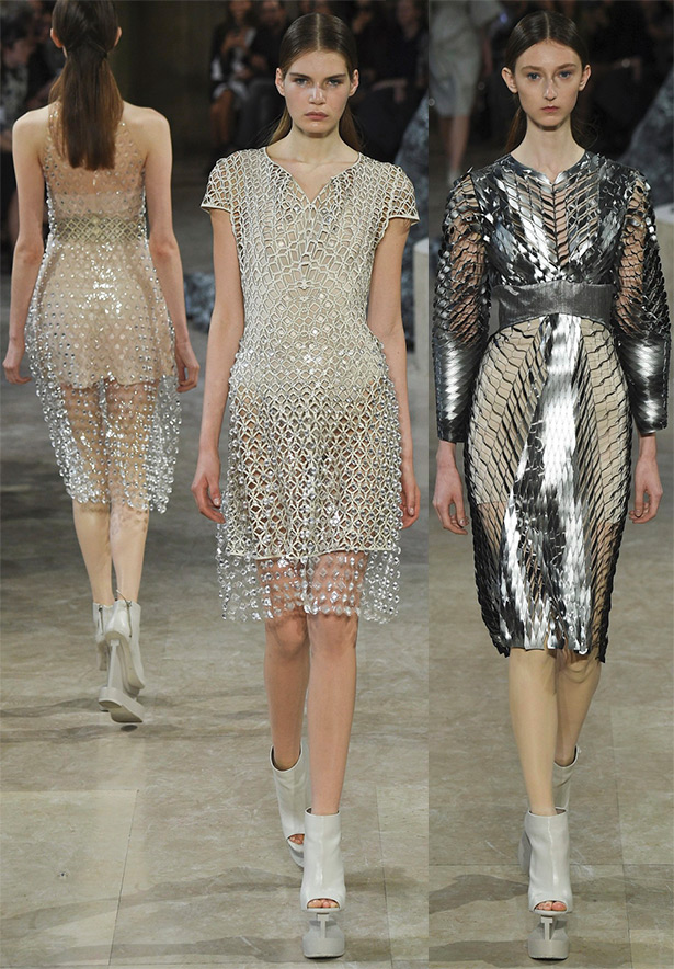
Iris van Herpen
Ermanno Scervino, Alexander Lewis
Brightness palette spring-summer 2024 especially impressive after the winter season, which is dominated by darker colors. And despite this, in the summer colors in many collections there is room for black and gray shades, turning into deep blue or purple tones.
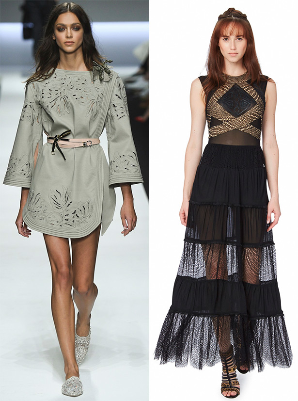
Ermanno Scervino, Tamara Mellon
Georgine, Anteprima
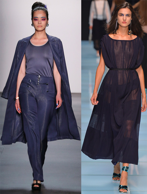
The Chanel collection is built on combinations of various shades of gray, lilac, blue, dark blue and graphite. The joyful and fresh collection of Ralph Lauren presented a real play of white, blue, red and red.
The PPQ collection is dominated by black, white and electric blue. All shades of white turn into purple haze in the Tadashi Shoji collection.
Many collections are built on a combination of different shades, bright colors embody the freshness of spring. The color scheme is based on optimism, freedom and imagination.
Whichever colors the designers suggest us, rely on your own preference. Pick a color that you like the most, which means you want to look at it and look at it ...
Comments and Reviews
Add a comment
Rating news
Shades of clothing that make women look younger
What shades of hair make women younger: rules and photos
Funny wedding dresses - photos and ideas
12 most expensive down jackets for the winter
How to look 25 at 40: tips from supermodels
Beautiful schoolgirls
Anti-aging haircuts and hairstyles for women
Fashionable skirts for autumn and winter
Fashionable women's trousers for the cold season
Fashionable and stylish sandals for summer 2024
Spring-summer 2024
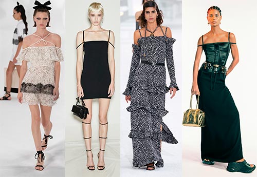 Fashionable dresses and tops with thin spaghetti straps
 Bandana tops: how to wear stylishly and beautifully
 How to put together the perfect men's wardrobe for the summer
 Trendy shorts for spring-summer 2024
 Fashionable skirts for spring-summer 2024: a guide to online shopping
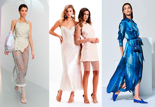 The most fashionable dresses spring-summer 2024: styles and colors
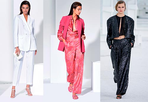 Fashionable total look 2024: image ideas and trends
