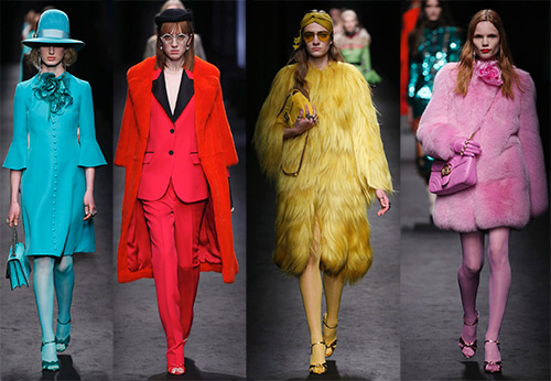
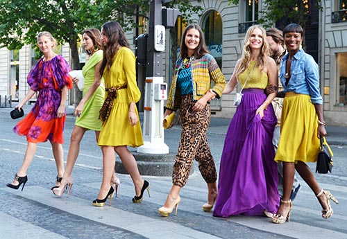
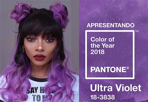
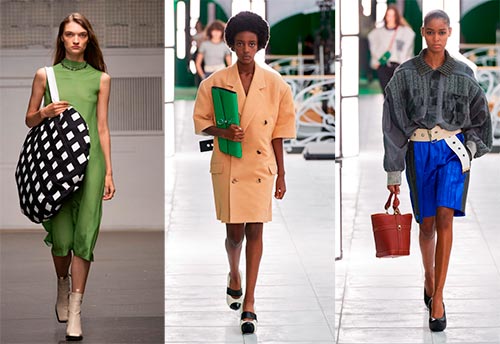
Fashion spring-summer 2024
Fashionable colors of 2024: trends and photos of images
Pantone announced two independent colors as the main color, or rather, the main colors of 2024: PANTONE 17-5104 Ultimate Gray and PANTONE 13-0647 Illuminating. Gray will not only serve as an excellent backdrop for a sunny and optimistic bright yellow, but will also play a major role as an independent color in the field of business wear.
These two colors should bring energy and hope into our life, reinforce the lost strength, overcome the feeling of insecurity, and gain the desire for life. Gray color is very practical and strict, but in combination with bright saturated colors, on the one hand, it warms up and gives sophistication, and on the other, softens unnecessarily flashy colors. Gray is calm and noble, even if he is assigned the role of a background.
“… The combination of a long-lasting Ultimate Gray with a bold yellow Illuminating expresses a message of positivity backed by fortitude,” says Leatrice Eiseman, executive director of the Pantone Color Institute.
".... We need to feel encouraged and inspired, this is important for the human spirit."
Ultimate Gray
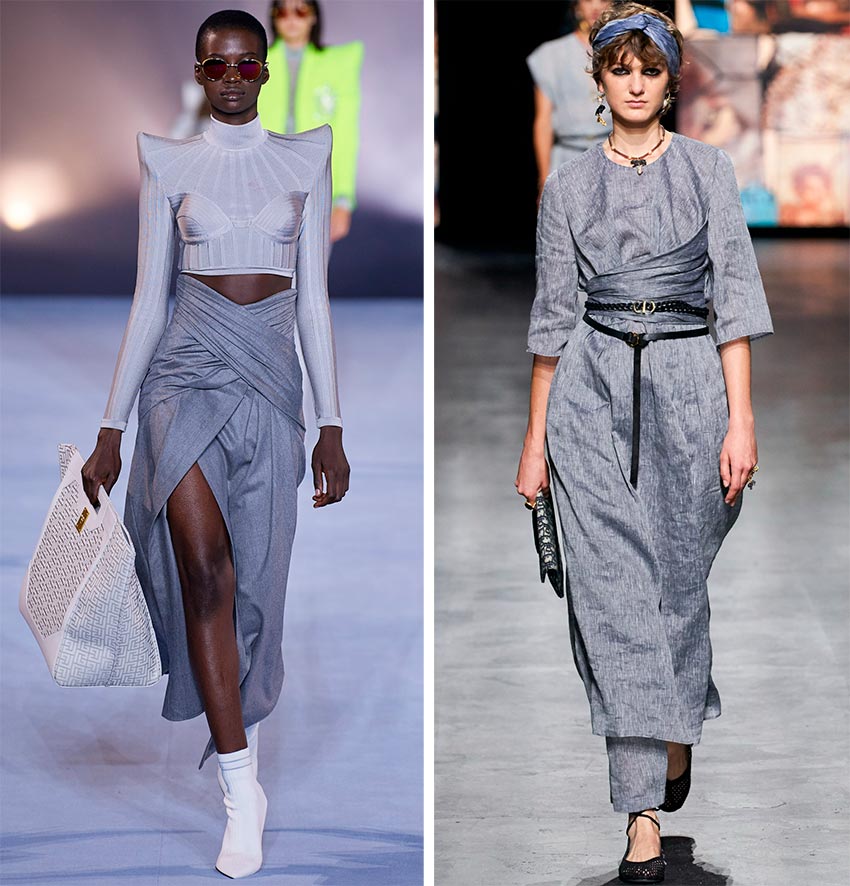
Balmain, Christian Dior
Illuminating
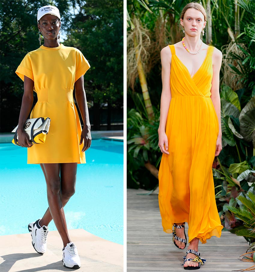
Iceberg, Jason Wu
New York Fashion Week color palette
Color palette on New York Fashion Week - Pantone Color Institute's choice for Spring / Summer 2024.
Main palette
In the main palette for the spring / summer 2024 season at New York Fashion Week, Pantone offers 10 rich and vibrant colors.
- Pantone 14-1050 Marigold (Marigolds - orange-yellow)
- Pantone 15-4020 Cerulean (Sky Blue)
- Pantone 18-1248 Rust
- Pantone 13-0647 Illuminating
- Pantone 18 -4140 French Blue
- Pantone 13- 0117 Green Ash
- Pantone 16-1529 Burnt Coral
- Pantone 16-5938 Mint
- Pantone 17-3628 Amethyst Orchid
- Pantone 18-2043 Raspberry Sorbet
As you can see, summer should be bright and joyful, and the color palette will certainly bring the most positive emotions. Despite the difficulties that many felt in 2024, let's hope that the summer season, although it will not become carefree for many, will at least fill our lives with optimism and cheerfulness.
In many collections of famous designers, there are many images made in one color or in shades of the same color, in other words, total look images, and among them the leading position is occupied by shades of yellow colors.
The designers' choice of orange-yellow and bright yellow color palette completely coincides with those offered by Pantone.
Marigold (Marigolds - orange-yellow)
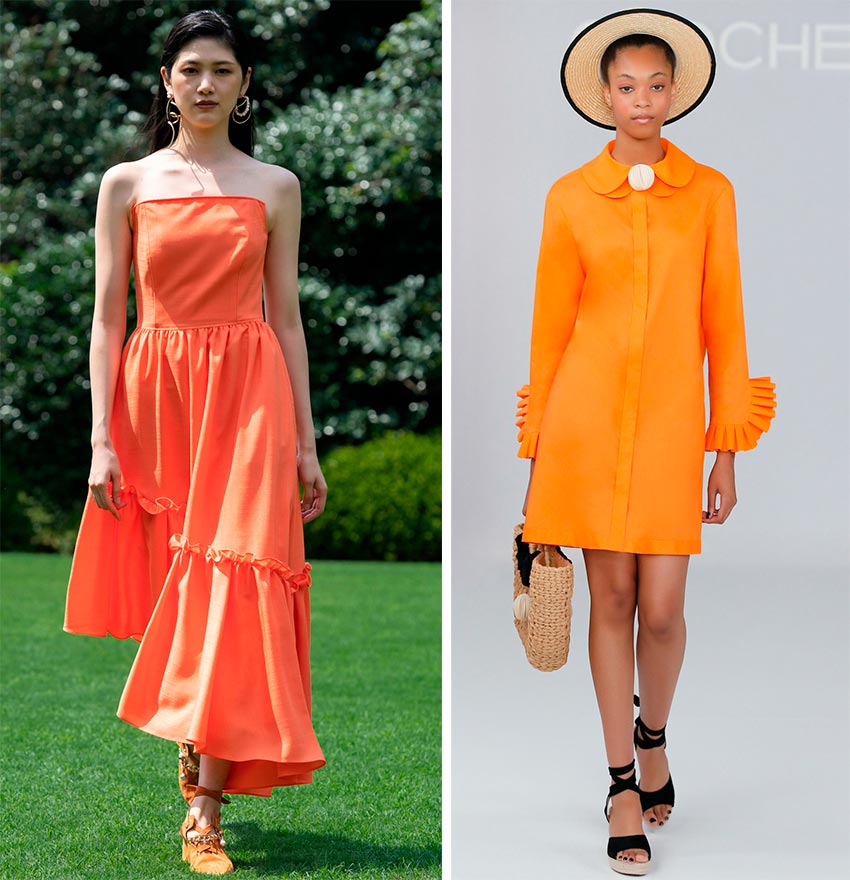
Adeam, Chocheng
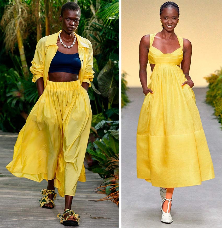
Illuminating
As already mentioned, this color has become the main color of the year. Let's hope the summer of 2024 will be as sunny and carefree as this cheerful color.
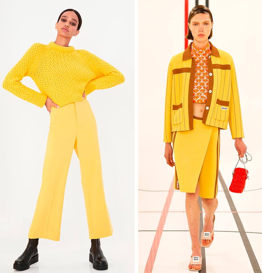
Photo above - Alice + Olivia, Miu-Miu
Photo below - Jason Wu, Zimmermann
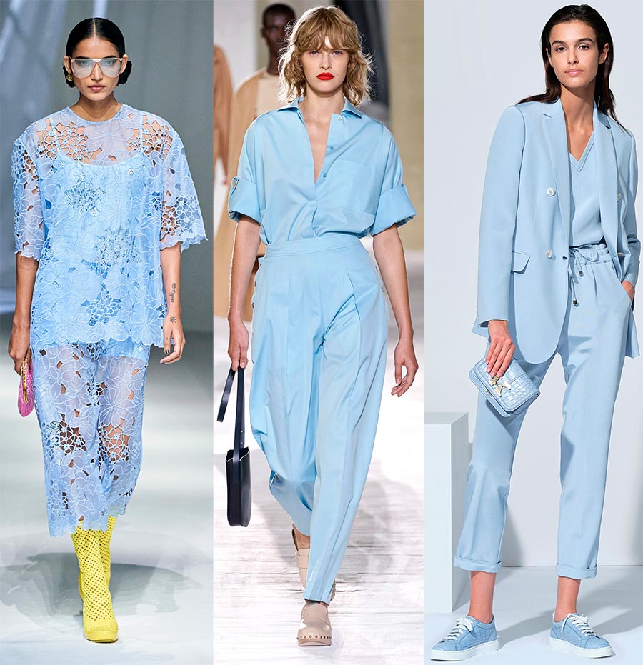
Cerulean (Sky blue)
Another color that has gained popularity among designers and completely coincides with the choice of Pantone. It is sky blue. Sky blue emphasizes tenderness, purity and freshness.
Its advantage is that with it you can create both gentle romantic and strict, business images. Sky blue is relevant at any time of the year, it cannot be overlooked, but in the summer it still gives the image freshness and cheers up.
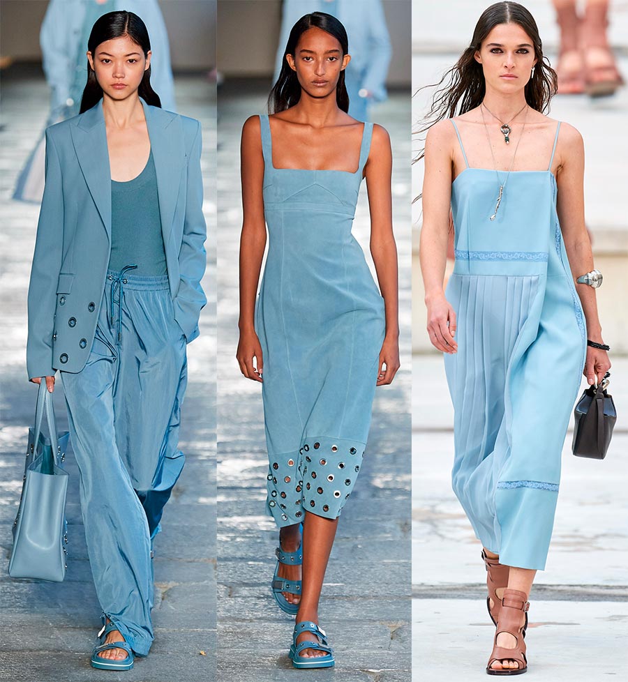
2 photos of Boss and Chloé
Fendi, Hermès, Kiton
Rust (Rust - a shade of rust)
A warm shade of rust was chosen by many designers, despite the fact that this color is just asking for an autumn palette, because it resembles the color of fallen leaves and the earth at the same time. Rust goes well with many other shades, such as green or yellow, peach or cream.
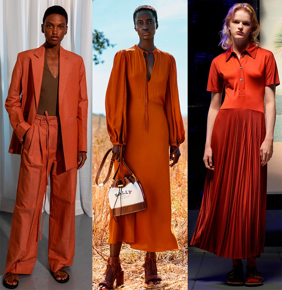
Eudon Choi, Bally, Paul Smith
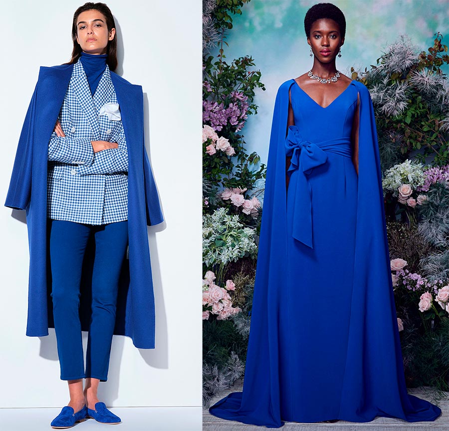
French Blue
It is a dazzling color. It suits both blondes and brunettes, the owners of blue eyes get a particularly luxurious look (the eyes seem to “turn” into precious sapphires).
Bright blue will add freshness and charm to the look.Your outfit in this color will be very useful for a festive situation.
To enhance the splendor of the bright blue color, you can use fabric - it can be satin or silk... The more expensive the fabric, the more luxurious the outfit will look.
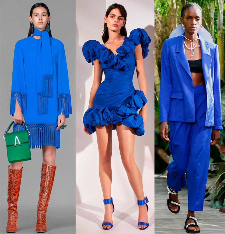
Andrew Gn, Zuhair Murad, Jason Wu
Kiton, Marchesa Notte
Green Ash
Green ash leaves in nature only vaguely resemble menthol color. A calm and light greenish shade, it looks great in combination with pastel tones, especially beige and cream, revealing its color to the fullest.
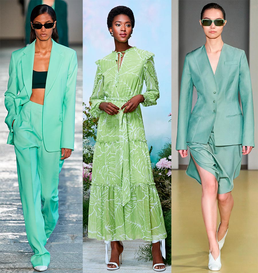
Boss, Marchesa Notte, Salvatore Ferragamo
Burnt Coral
Sometimes poetic names are heard at the Institute of Color. In this case, this may not be the case, but if the emphasis is on the burnt coral, then it becomes clear that this is not a bright shade. Yes, indeed this time the choice was settled on the pale coral. But you must admit that he looks luxurious in a dress, a skirt, and trousers.
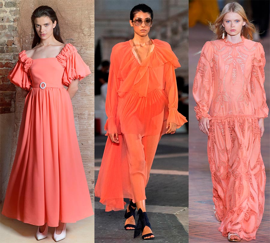
Edeline Lee, Laura Biagiotti, Alberta Ferretti
Mint
The bright green color was called the color of mint. Mint can also be different (it all depends on the variety). But interesting and sometimes mysterious names are only intriguing. I would like to take a closer look at such outfits, try them on and, of course, think over all the options for combining with other colors….
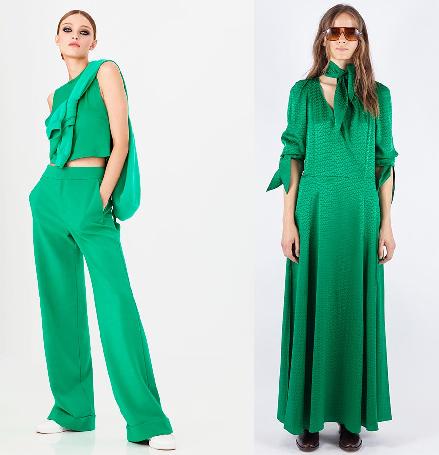
Alice + Olivia, Zadig-Voltaire
Amethyst Orchid
Amethyst color... The stone is the dream of many gem fans. It belongs to the group of quartz stones, but at the same time one of the most beautiful and expensive stones. Shades of amethyst will allow you to choose exactly the one that suits you.
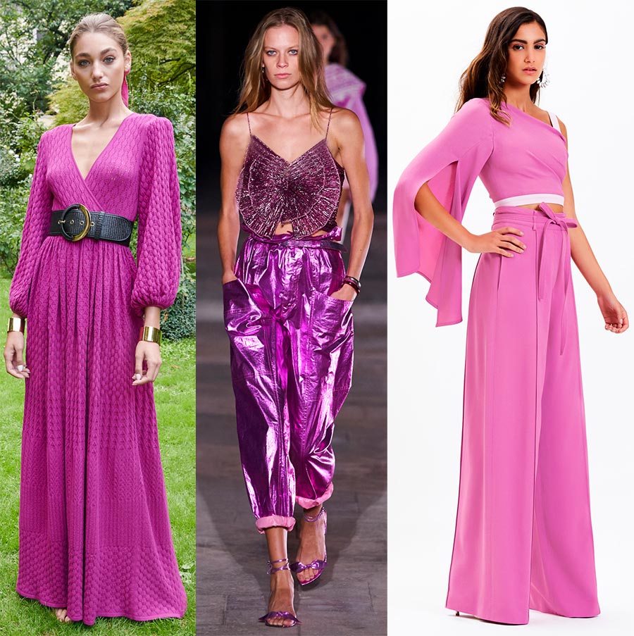
Luisa Spagnoli, Isabel Marant, Dennis Basso
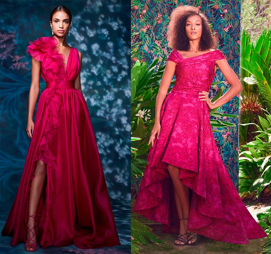
Raspberry Sorbet (Raspberry sorbet)
Raspberry sorbet. And one can immediately feel its amazing taste and aroma. But raspberries also delight us with their color. The color of ripe raspberries has a colder tone compared to classic red. Crimson color in clothes can give your image some mystery, since it combines passion on the one hand, and coldness on the other. If you doubt how comfortable you will be in a raspberry-colored outfit, choose accessories in a raspberry-colored outfit - the image will also look gorgeous.
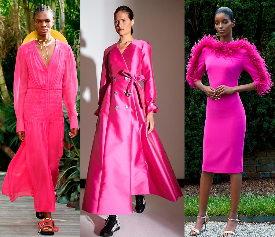
Jason Wu, Alexis Mabille, Badgley Mischka
Marchesa, Tadashi Shoji
Basic palette 2024
For the basic palette, Pantone chose five neutral shades:
- PANTONE 19-4016 Inkwell - Inkwell
- PANTONE 17-5104 Ultimate Gray - Absolute Gray
- PANTONE 11-0110 Buttercream - Buttercream
- PANTONE 14-1127 Desert Mist - Desert Mist
- PANTONE 16-0632 Willow - Willow
So what are these colors?
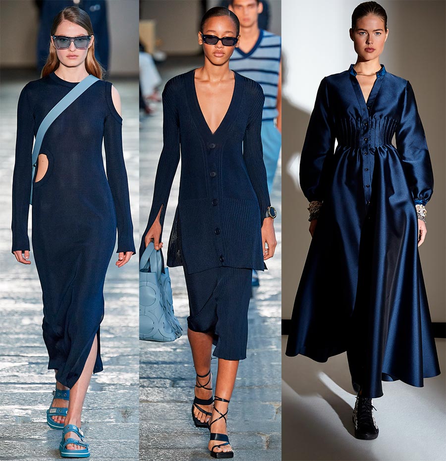
Inkwell (Inkwell - dark navy blue)
Dark blue and so dark that it is almost black. Did you know that black is always needed in a wardrobe? Yes, undoubtedly, the dark color does not suit everyone, especially women 50+, but there is an opportunity to experiment and find your own version. This can be helped by various decorative elements and decorations, and somewhere the texture of fabrics.
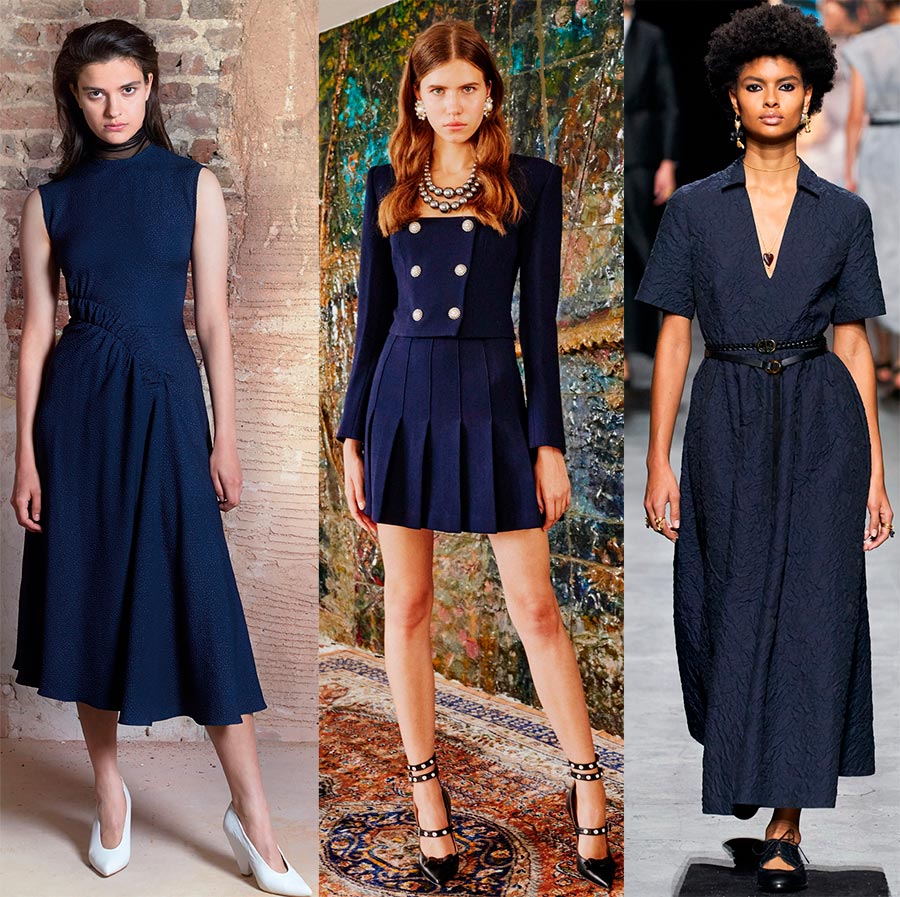
Edeline Lee, Alessandra Rich, Christian Dior
2 photos of Boss and Alexis Mabille
Ultimate Gray
We already know about this color as the main color of the year. Calm and reliable gray is included in the basic palette.
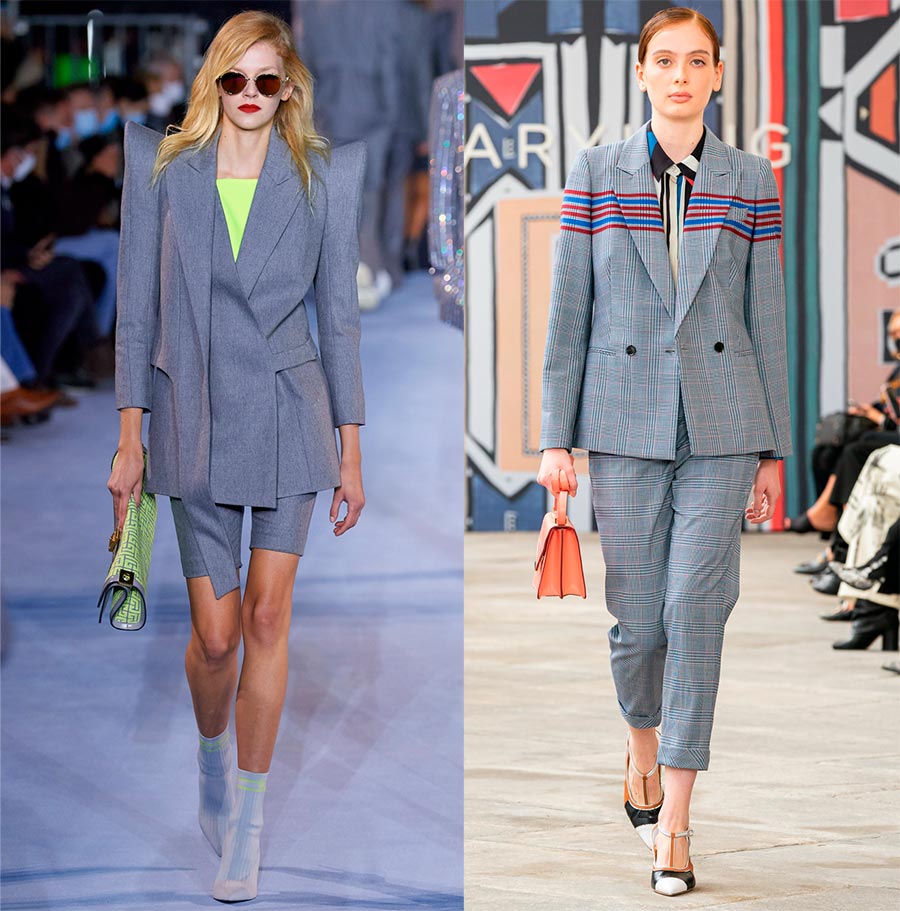
Balmain, Maryling
Buttercream (Butter cream)
Delicious butter cream. The outfits in this color are accompanied by many other colors, so it is rightfully considered the basic one.
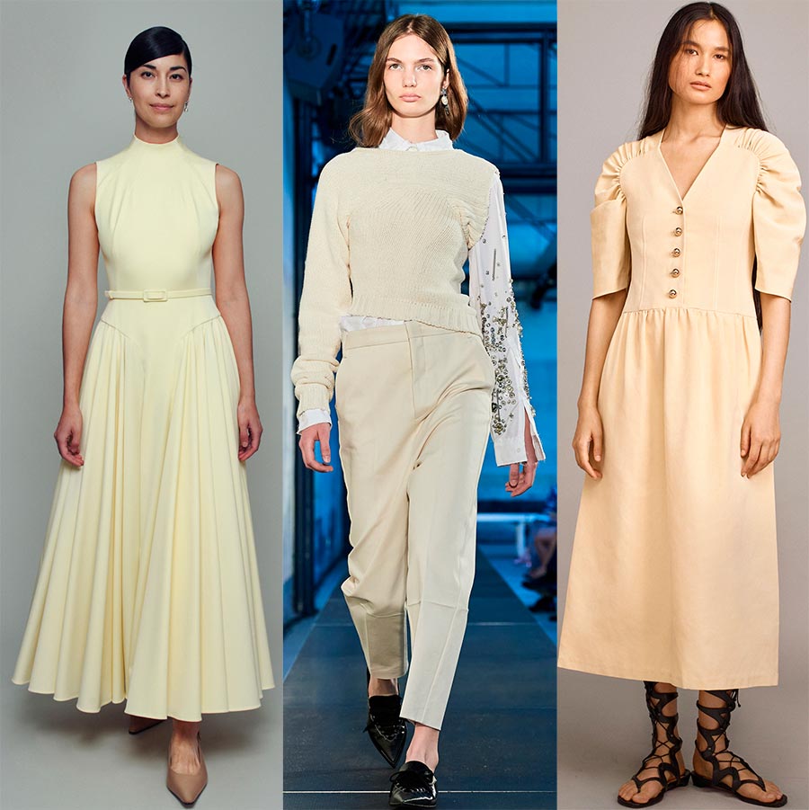
Emilia Wickstead, No.21, Rebecca Taylor
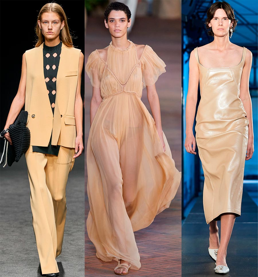
Desert Mist
Desert, quicksand, hot sun blinds the eyes. And the color of the sand is always accompanied by a feeling of warmth, which you want to refresh with other shades. So the sands are a field for imagination and experimentation.
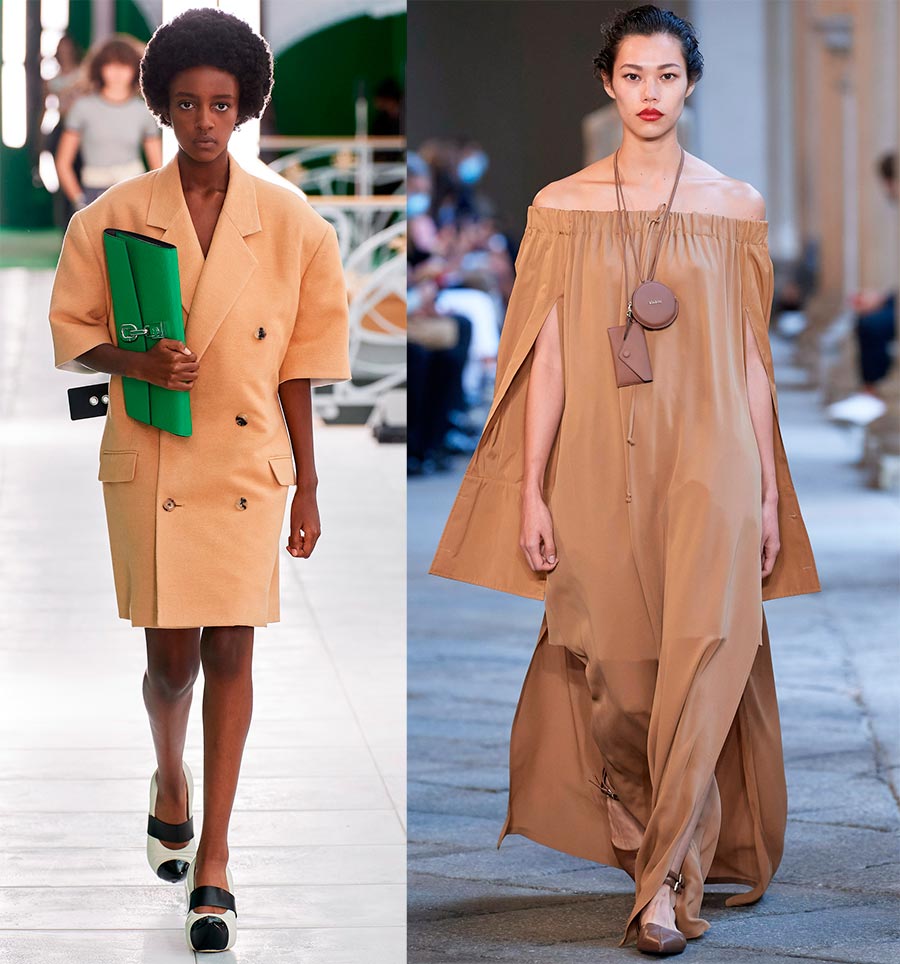
Louis Vuitton, Max Mara
Simona Marziali, Alberta Ferretti, No-21
Willow (Willow - brown with a green undertone)
Green willow, bent over the river. But in this case, the color offered by Pantone resembles only greenish brown bark and willow stems, which is very suitable for the base color.
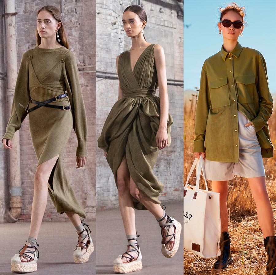
2 photos Altuzarra and Bally
And so, we looked at what colors were at New York Fashion Week. If you haven't seen the shades you most expected, take a look at the London Week color palette.
The color palette of London Fashion Week 2024
Primary colors
- PANTONE 14-3205 Pirouette - Ballet Powder
- PANTONE 16-0436 Pickled Pepper
- PANTONE 15-3716 Purple Rose - Purple rose
- PANTONE 16-1253 Orange Ocher - Orange ocher
- PANTONE 13-5412 Beach Glass - Beach Glass
- PANTONE 14-1050 Marigold - Marigolds
- PANTONE 18-4250 Indigo Bunting - Indigo Bunting
- PANTONE 18-1552 Lava Falls - Lava Falls
- PANTONE 13-0647 Illuminating
- PANTONE 16-4535 Blue Atoll - Blue Atoll
Pirouette (Ballet powder)
Ballet powder is an unusually delicate shade. It will certainly add airiness and lightness to the image. The translucency of pink can enhance the right material. The shade looks great in summer outfits.
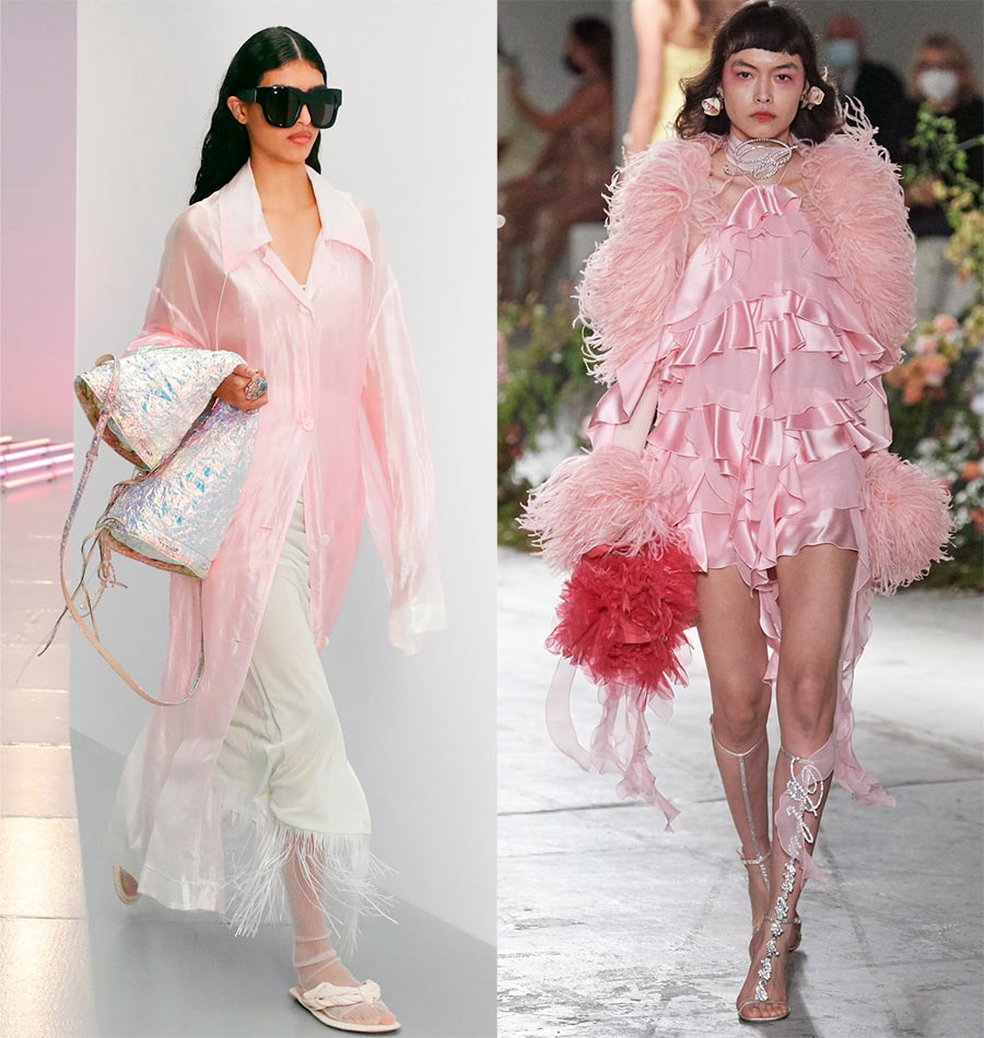
Acne Studios and Blumarine
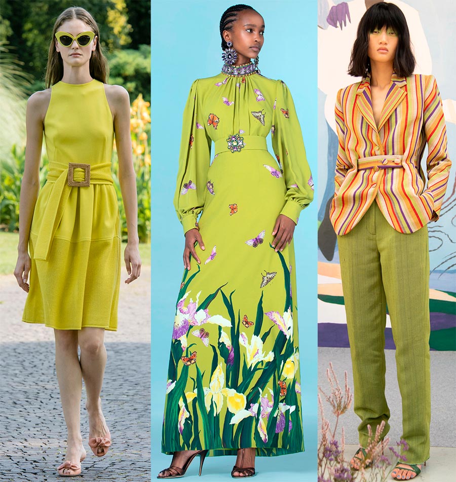
Andrew Gn, Chanel, Emilia Wickstead
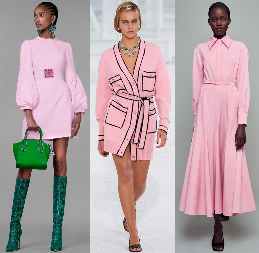
Pickled Pepper - Pickled Pepper
You can also try pickled peppers. Its taste properties may not suit everyone, but only those who love something spicy in cooking. But the color will play great on blondes, brown-haired and red-haired girls.
Genny, Andrew Gn, Kenneth Ize
Purple Rose - Purple rose
Delicate lilac shade with a slightly purple tone. Florists assure that these roses do not like a bright neighbor, it is better to surround them with snow-white flowers, against which they will stand out for their beauty. Apparently, we should also take this advice into account and combine lilac shades with white or creamy ones.
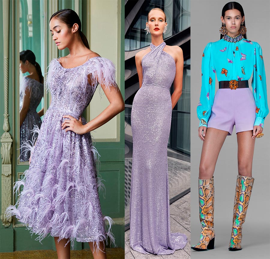
Pamella Roland, Naeem Khan, Andrew Gn
Orange Ocher - Orange ocher
Yes, orange ocher has a color similar to that of rust. You say - depending on what kind of ocher and what color of rust. Yes it is. But all these colors are related to each other, and they are united by their terracotta color. Shades look great on dark brown-haired women with brown or green eyes.
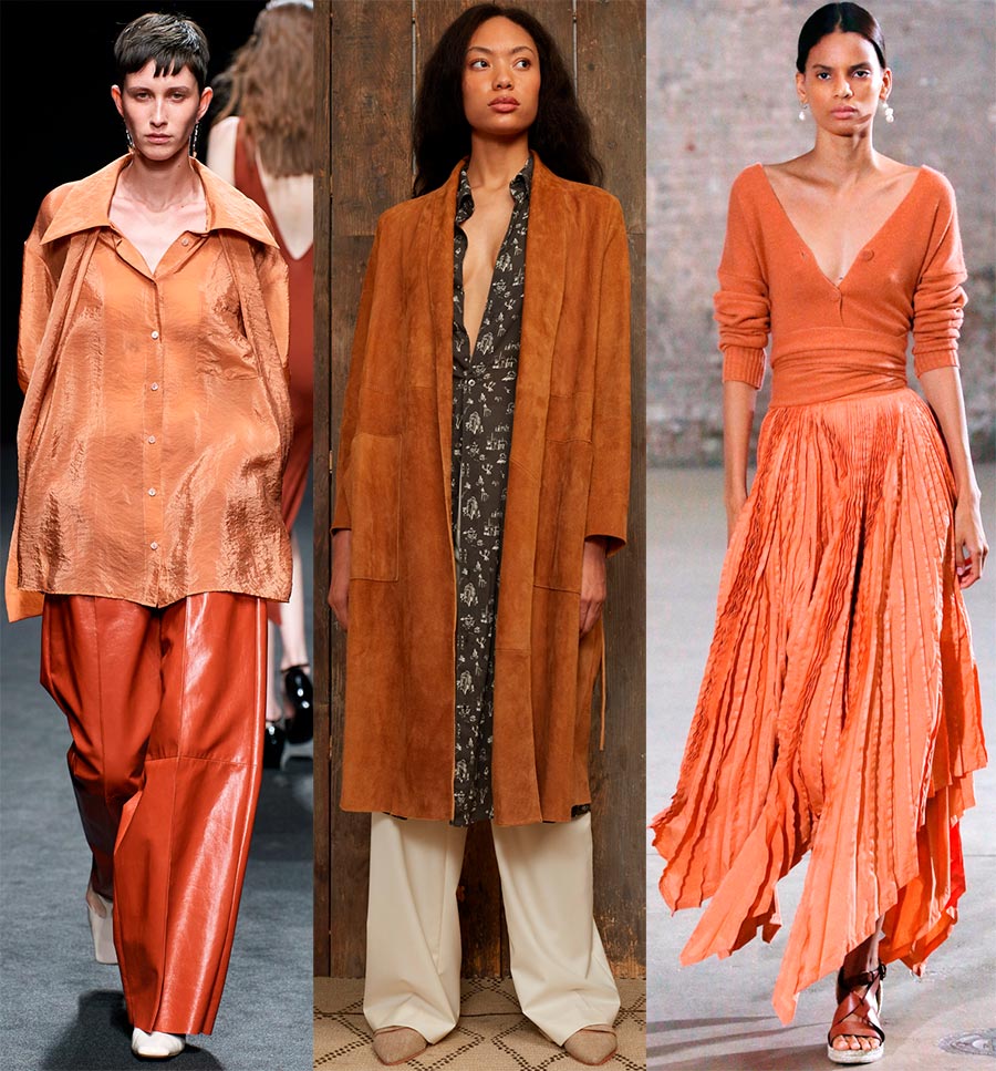
Drome, Billy Reid, Altuzarra
Beach Glass - Beach Glass
The Pantone Color Institute considers Beach Glass to be a watery hue reminiscent of glass, "... smoothly smoothed by waves and currents." It seems to us that the most successful looks with this color came from Giambattista Valli and Giorgio Armani.
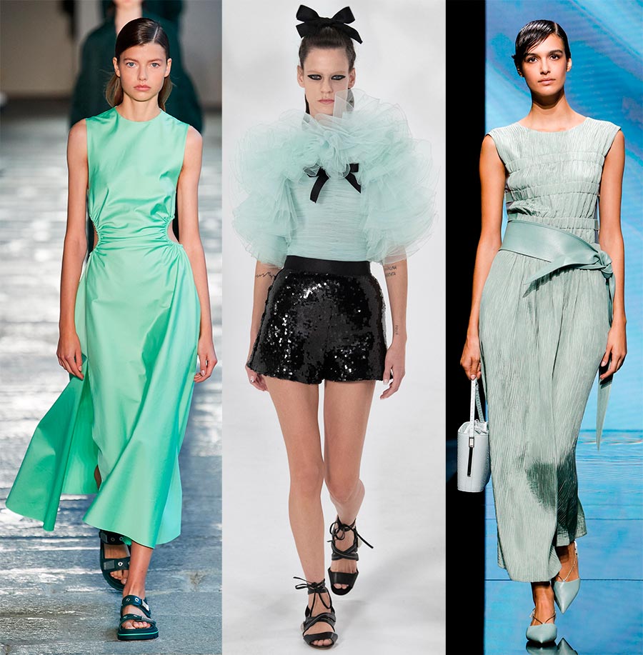
Boss, Giambattista Valli, Giorgio Armani
Marigold - Marigolds
The color is bright and cheerful, but the variety of shades is large enough. The Color Institute chose exactly those marigolds, which in England are called Marigold (Mary's gold). Marigolds in the language of flowers is a symbol of fidelity. They feel warm, and their color is attractive both in summer and autumn.
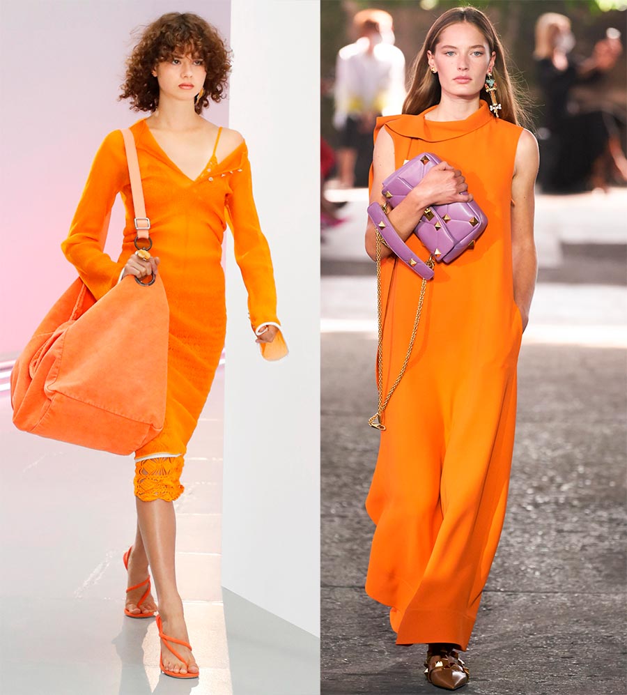
Acne Studios, Valentino
Indigo Bunting - Indigo Bunting
Blue was the main color of 2024, in the new 2024 we are greeted by different shades of blue, including the blue color proposed in the London palette - indigo oatmeal.
If you want to see this particular bird, when searching for a photo, you must definitely add indigo, then you will definitely see a blue oatmeal, similar in size and an article to a sparrow, but its plumage is of extraordinary beauty.
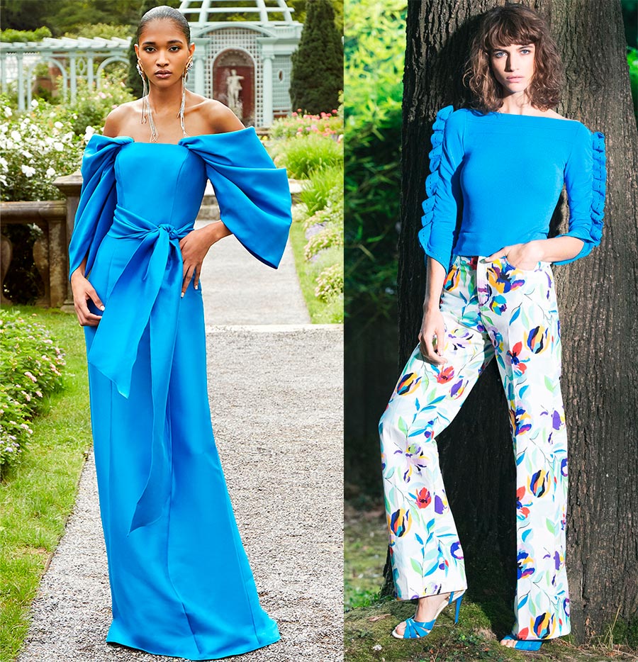
Badgley Mischka, Emanuel Ungaro
Lava Falls - Lava Falls
And again the color from Pantone and its new mystery - the Lava Falls. There are a lot of red shades in the collections, all are different, but Pantone offers just this one - Lava Falls. “This hot, molten red is erupting in a stream of energy,” is how the Pantone Institute describes the color. And we can remember the song from the movie "The Diamond Hand" "Help me", in which it is sung about the volcano of passions.
“… I didn't know how to love before,
Fiery, fiery.
In my soul you carelessly
They woke up the volcano ... "
Fiery, fiery.
In my soul you carelessly
They woke up the volcano ... "
The volcano's fire-breathing lava will perfectly match the pastel colors of the new season's palette.
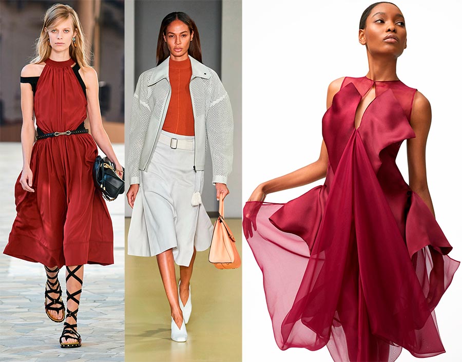
Ports 1961, Salvatore Ferragamo, Sukeina
Illuminating - Illumination
Sunlight, which appeared in both New York and London palettes, and as the main color of the year.
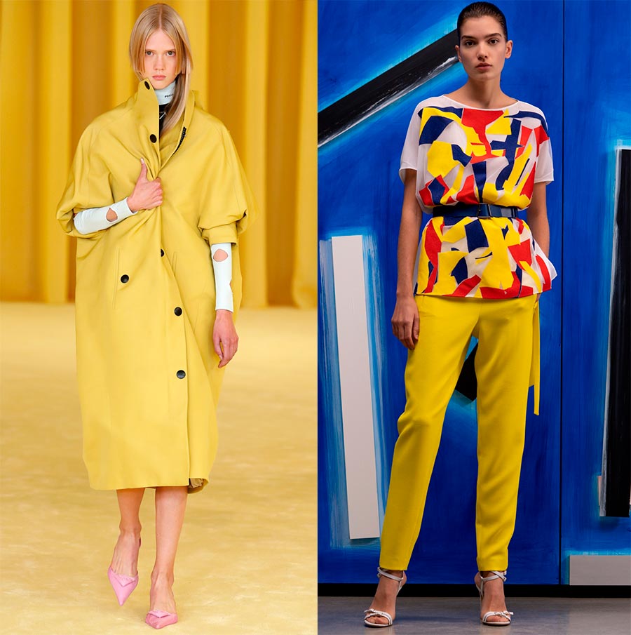
Prada, Akris
Blue Atoll - Blue Atoll
Turquoise. The stone has different shades, but this color is pure and vibrant turquoise. Pantone thinks it is a reminder of a tropical island in the sea. Let's hope that with the arrival of summer, many will see such islands.
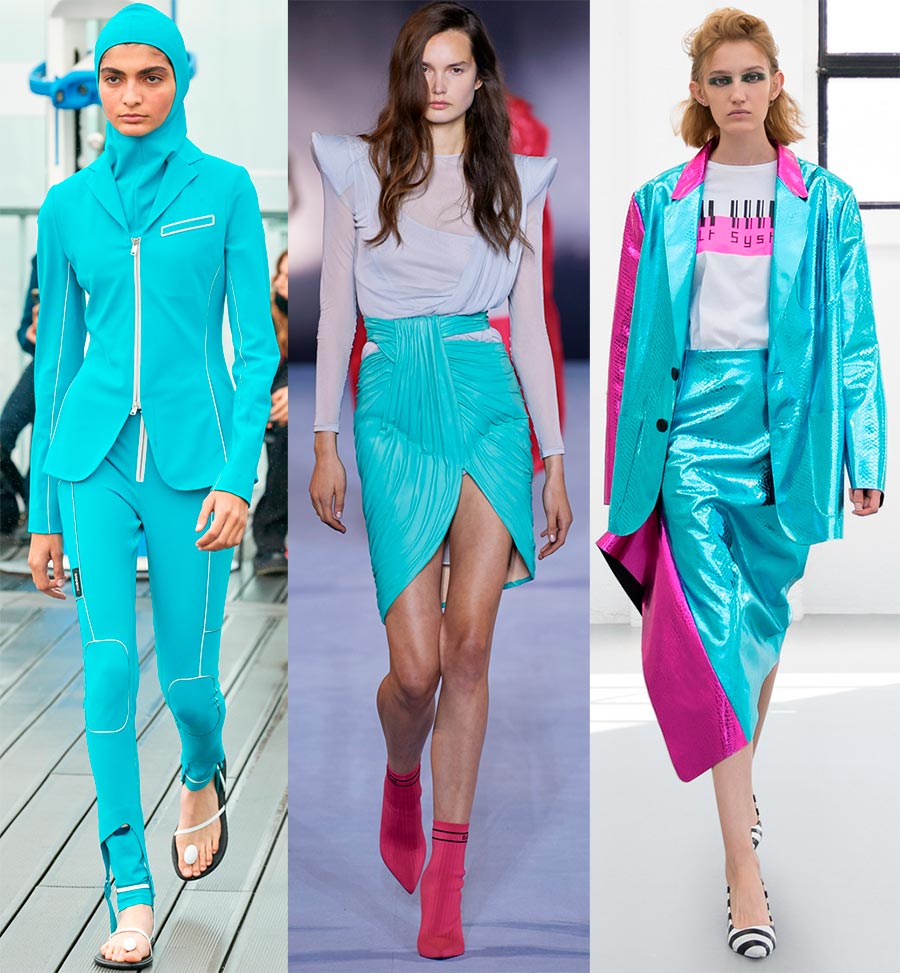
Coperni, Balmain, Gilberto Calzolari
Basic colors
And here are the basic, or neutral colors.
- PANTONE 11-0202 Baby's Breath - Lighter than air, like a baby's breath
- PANTONE 17-1221 Macchiato - Macchiato
- PANTONE 19-4105 Polar Night
- PANTONE 17-5104 Ultimate Gray - Absolute Gray
- PANTONE 16-0632 - Sphagnum - Sphagnum
Baby's Breath
Now let's see how the designers dressed their female models in sophisticated and weightless white and cream outfits. It is somewhat different from buttercream, its color is slightly colder and more transparent, Pantone calls this color "lighter than air".
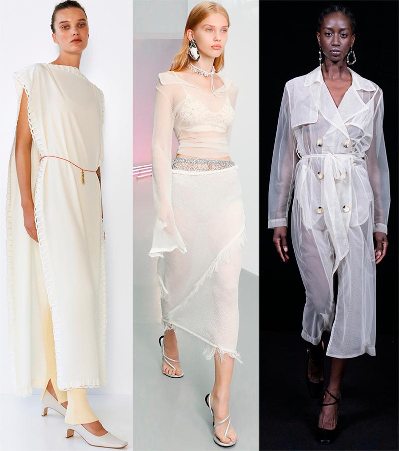
Bevza, Acne Studios, Act N 1
Macchiato - Macchiato
Many girls love macchiato. But still, let's explain that Macchiato is Italian coffee, and its shade is warm, creamy. Macchiato literally translates as stained or speck.The coffee drink got this name because of that speck of coffee that appears on the white milky surface of a freshly prepared macchiato. This coffee drink is made with espresso (30 ml) and about 50 ml of frothed milk.
Now let's see how it looks on the models.
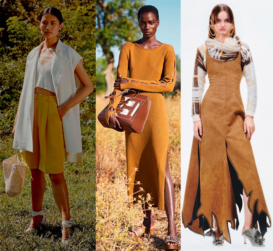
Anteprima, Bally, Y Project
Polar Night - Polar night
Deep blue, like the polar night, color. Looking at him, it seems that stars will now light up against the background of the blue.
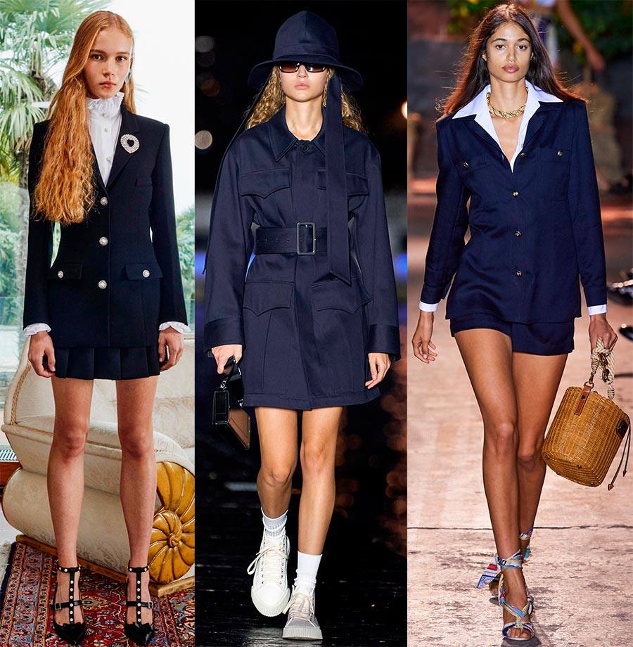
Alessandra Rich, Ami, Etro
Ultimate Gray - Absolute Gray
And again, the main color of the year is Absolute gray. A stable and reliable color will help us in the new year to concentrate and calmly solve emerging difficulties without losing our composure.
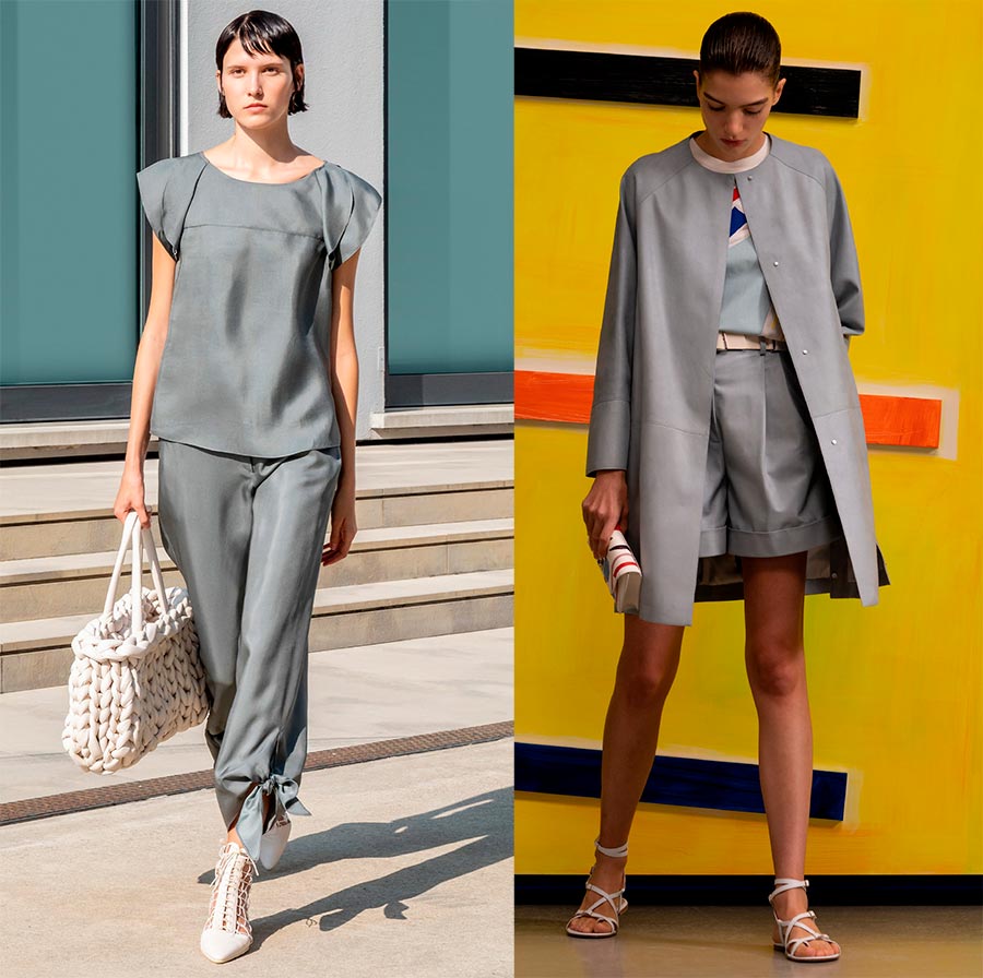
Emporio Armani, Akris
Sphagnum - Sphagnum
Sphagnum is a type of marsh moss, also called peat moss. From here we see - if it grows in a swamp, then the color, in addition to the green tint, should also contain shades of brown. Everything is logically proven. All these shades are present in the sphagnum color. A beautiful base shade of earthy green will perfectly fit not only in the military style ...
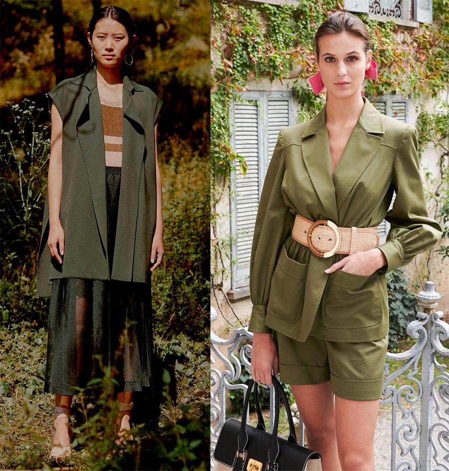
Anteprima, Luisa Spagnoli
If we compare both color palettes, then we will see their similarity or complete similarity. So, for those looking for more vibrant colors, make your choice based on the color shades of London or New York Week. There are many options, the main thing is that your decision should have the right choice, taking into account your color type and shape.
Comments and Reviews
Add a comment
Similar materials
Rating news
Shades of clothing that make women look younger
What shades of hair make women younger: rules and photos
Funny wedding dresses - photos and ideas
12 most expensive down jackets for the winter
How to look 25 at 40: tips from supermodels
Beautiful schoolgirls
Anti-aging haircuts and hairstyles for women
Fashionable skirts for autumn and winter
Fashionable women's trousers for the cold season
Fashionable and stylish sandals for summer 2024
Spring-summer 2024
 Fashionable dresses and tops with thin spaghetti straps
 Bandana tops: how to wear stylishly and beautifully
 How to put together the perfect men's wardrobe for the summer
 Fashionable shorts for spring-summer 2024
 Fashionable skirts for spring-summer 2024: a guide to online shopping
 The most fashionable dresses spring-summer 2024: styles and colors
 Fashionable total look 2024: ideas of images and trends
